RiseSmart
WEB (Research, IA, UX) | 2019
Redefining the wayfinding experience for job seekers
DELIVERABLES
Information Architecture
Wireframe
My Role
Project Lead
Strategy
Research
Design
TEAM
3 Designers
TIMELINE
3 Weeks
RESEARCH
Card Sorting
Tree Testing
Usability Testing
Overview
The Company
RiseSmart was founded in 2007 as an outplacement company, helping organizations support their laid-off employees with career transitions. In 2015, it was acquired by Randstad, a world-leading HR company, now supporting clients across the entire talent life cycle — from talent acquisition to talent transition. The core services we provide include career coaching, resume writing, job matching capabilities, tools, and resources that help people grow in their careers.
The Product
Spotlight is our flagship product. It serves as the one-stop shop for laid-off employees to receive the services we provide and the resources they need to get back on their feet.

Before the redesign
The Project
As you can see, this product looks somewhat outdated. Yes, you are right. It was due for a revamp from both the user experience and aesthetic perspective. I’d like to share with you the “not-so-simple-but-worth-the-while” journey we took to redefine the wayfinding experience for our users.
The Problem
If users can’t find it, it doesn’t exist
No matter how great a new feature was, if people didn’t know about it or couldn’t access it, it didn’t matter.
For context, this platform was built about 10 years ago and hasn't changed much since then. Over time, feature after feature was added to the website, or more precisely speaking, “squeezed” into the existing structure because of the same old story - we don’t have time to change things.
The result was that the menu got longer and longer, which made it difficult for the users to navigate around. It also made designing more challenging because the existing UI framework just couldn’t hold onto more items due to the limited real estate on the screen. It’s just not sustainable.
Therefore, we decided that it was time to tackle the issue with a holistic approach.
Design Brief
Redefine the wayfinding experience to help job seekers easily understand what’s being offered (Discoverability) and where to find them (Findability).
My Role
I led two designers to complete the redesign project from research to delivering the information architecture and wireframes. I developed the strategy, conducted user research, analyzed data, and proposed new information architecture and wireframes to the greater product team.
Challenges
A challenge is not considered a challenge without obstacles. The first battle we had to fight was to get the buy-ins from the business.
“It’s working just fine. Why bother?”
Apparently, we see things very differently. The business didn’t see that there was any problem with the user experience. UX issues are like Covid. If we don’t test, we don’t know. Therefore, I set out to conduct user testing to gain evidence that would back up the story.
Resistance to change
I later learned that there have been attempts to redesign the platform in the past, but the outcome wasn’t as effective. So, naturally, people were not very enthusiastic about another redesign for fear that it would be time-consuming, and who knew if it would be successful or not?
I overcame this challenge with a solid plan for how we get there and keeping the scope of the project under a timeframe and budget that was acceptable to the business.
Pillars of Success
To deliver a good wayfinding experience, we need to get three things right - Structure, visual, and relevance.
Strategy
The strategy to success was based on a simple principle - to involve users along the way.
Our plan was to tackle the redesign in these five steps:
Step 1: Measure the findability and discoverability of the current platform to validate the problem and set the benchmark for us to be able to compare the impact before and after the redesign.
Step 2: Uncover the user’s mental model through card sorting. Take those insights and transform them into site structure (Information Architecture). Iterate and refine the structure with tree testing.
Step 3: Then, transform the site structure from Step 2 into wireframes followed by
Step 4: UI design that incorporates the latest branding and information hierarchy.
Step 5: Lastly, evaluate the performance of the new design against the benchmark to confirm if we have solved the problem and by how much.
Process
The scope of this case study covers the work up to the wireframe design, so I’ll walk you through the first three steps of the greater redesign project to validate the problem, define the site structure, and translate that into wireframes.

Step 1: Measure
We kicked off the project by measuring the findability and discoverability of the current platform. This allowed us to validate the problem and set the benchmark for us to be able to compare the impact before and after the redesign.
How do we know if it’s a real problem?
To gain support from the business, I conducted usability testing to validate the problem by collecting both qualitative and quantitative data. This exercise successfully helped us gain the buy-ins and the budget we needed to move forward.
I synthesized the findings to identify where users struggled and what the underlying causes were.
Step 2: Site Structure
Instead of letting the “experts” define the site structure, I believed we’d have a better chance of arriving at a more intuitive structure if we let the people who’d be using the system “tell us how to design”.
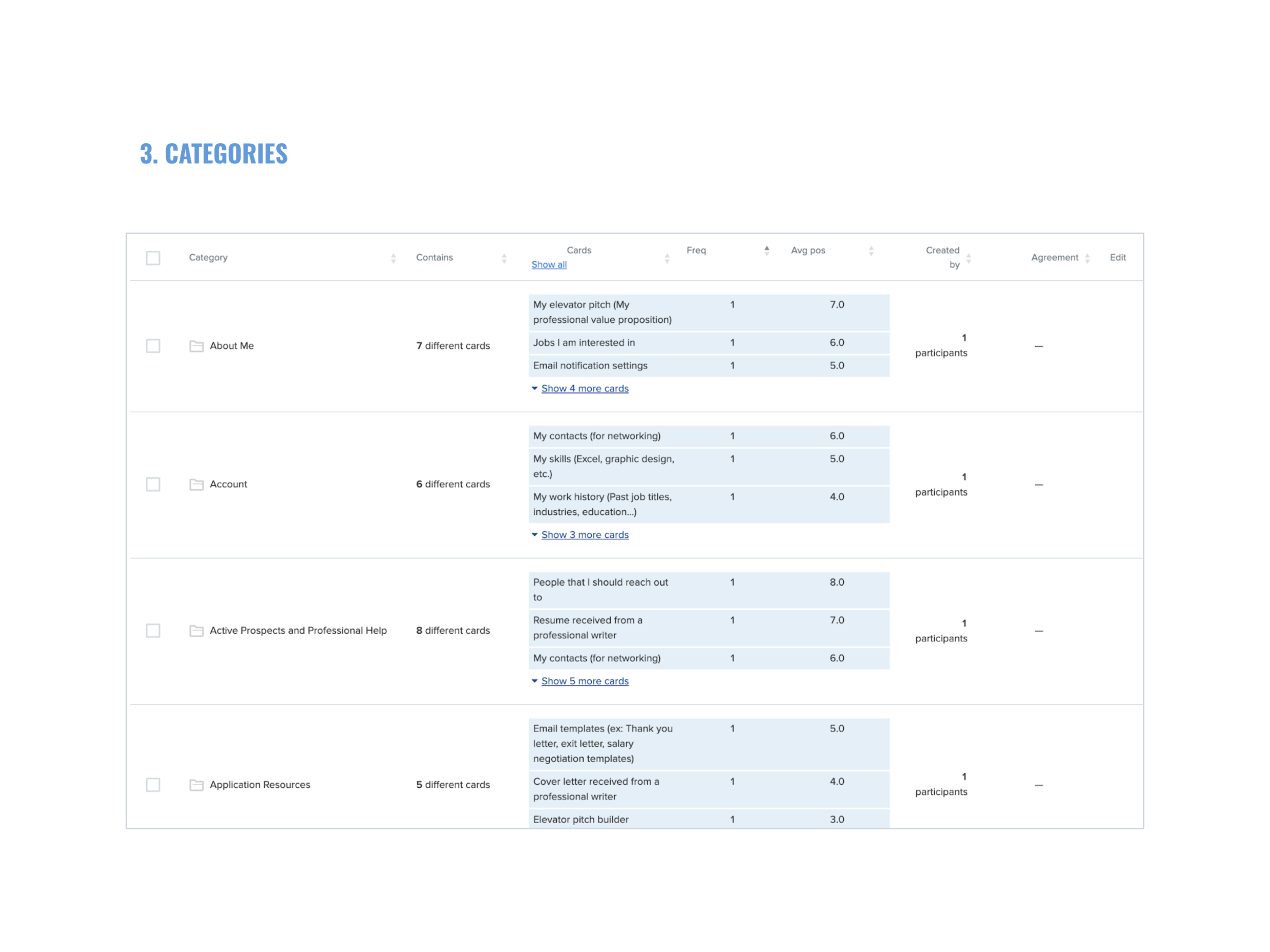
We performed card sorting to uncover the user’s mental model; took those insights and transform them into the site structure; and iterated it through a few rounds of tree testing.
Card Sorting
Card sorting is a research method for understanding how users make sense of the information on your website. Users are asked to sort a deck of cards that represent the content on your website into categories as they see fit. In this case, we performed a remote unmoderated open card sort where participants had to define the labels for the categories they created. From there, we would be able to gain inspiration on how to better sort the content on our site.
Preparation
To prepare for the actual card sorting that was done online, we performed a physical card sorting in the office within the internal team to make sure the cards were clear and that our product managers were aligned on the purpose and process of the exercise.
Logistics
Open card sort
Remote, unmoderated
29 cards
9 participants
Median time to complete: 10 mins
Tools: OptimalSort & Zoom
We used OptimalSort, an online user research tool, to help us speed up the process from recruiting participants to data analytics.
Analysis
We looked at the data by slicing and dicing them in different ways:
Participants: How did people sort information on an individual level? What was the logic behind the groupings?
Cards: What were the categories created for each card? Was there any consistent pattern?
Categories: What categories did people create? What cards were sorted under these categories?
Similarity Matrix: How often were two cards paired together?


Findings
We’ve discovered some very interest findings such as the different ways people sort information:
By relation to me: me vs. not me
By progression: past, present, future
By urgency: to-dos vs. no action needed
By stages in job search: preparation, search, interviews, offers received
By topics: interviews, resume, job search, networking
An epiphany moment
I was so eager to find the perfect way to sort information until I realized that there was no such thing as the perfect way because not everyone thinks the same. That’s because we are different in so many ways from gender, age, occupation, background, to personal goals. This led me to the conclusion that we should design for users of different mindsets. We can achieve this by providing multiple pathways to the same destination.
What next after card sorting?
While card sorting is great for understanding how our users think, it doesn’t tell us how to group the information. For example, each user thinks differently, so a structure that works for one person may not work for the other. You may also see participants tossing a card into a random category when it doesn’t seem to fit anywhere else. These are all understandable because card sorting is just an exercise aimed to learn how people think.
We need to come up with our version of the site structure balancing user and business needs, followed by tree testing to validate our assumptions.
Tree Testing
Tree testing is a research method that tells us how easily people can find information with our site structure and where they get lost. It is great because it strips away the visual design from the equation, allowing us to focus on the logic and labeling of the structure.
Tree testing is incredibly useful in answering questions like:
Can people understand my labels?
Does my grouping make sense to people?
Can people find the information they want easily and quickly? If not, what may be the underlying cause?
The challenge with multiple designers
We found ourselves in a difficult situation where each designer had come up with a unique structure. How would we know which one was better? And, would the better one really solve the problem? Would it create new problems?
We decided to resolve this conflict in a civilized way - tree testing!
Preparation
First, we prepared our trees in a shared spreadsheet, where we could easily visualize, modify, and debate over them.
Our proposed tree
We then created user tasks that focused on our key offerings and potential problem areas.
User tasks
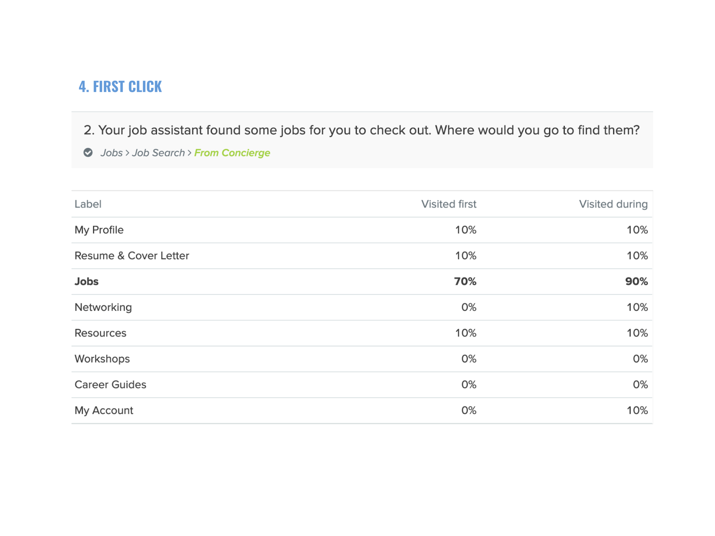
Then, We used Treejack, a tree testing tool from OptimalWorkshop, to expedite the entire process from recruiting to data analysis. The following demo shows how a participant worked through the test by clicking through the tree to get to the destination.
Task: Your job assistant found some jobs for you. Where would you go to find them?
Strategy
Logistics
Remote, unmoderated testing
Tested 4 trees
10 Participants / Tree
6 Tasks / Tree
Average time to complete: 3 mins
Analysis
For each test, we looked at the results from different angles:
Success rate
Pietree
Destinations
First click
Paths


Step 3: Wireframe
Arriving at an intuitive site structure was only half of the battle. The next step was to transform that structure into an interactive experience that users could see and engage with. The UI design needs to clearly communicate affordance, information hierarchy, and relationships through carefully arranged layout and selection of components.
We created rapid interactive prototypes to enable team discussion and collect feedback from stakeholders.
Here’s one of the prototypes I built with UXPin for quick exploration:
Ideally, we would incorporate user testing in the wireframing stage, but with a shift in priority, we had to push this through under the time given. Eventually, the design team was able to collaborate closely and arrive at a solution that we were proud of.
Outcome
How well did we do?
The old design didn’t work out because users were not part of the design process, and the design “system” that we were using was outdated and didn’t meet our needs today. By following the user-centered design process, we were able to arrive at a more intuitive and effective design.
How we improved findability and discoverability:
Reduced cognitive load by cutting down the amount of text and visual distractions on the screen. By limiting the number of primary buttons displayed on one page, users are now able to focus on the main tasks.
Introduced a more sustainable navigation UI by using dropdowns in the navigation menu to allow for second-layer information access. This solved the issue of the limited horizontal space, especially for users with smaller devices.
Adopted easy-to-understand labeling. We moved away from marketing jargon to simple language that people speak. For example, we replaced “Your brand” with “My resume”.
Surfaced our key services that were previously hidden from the UI, such as resume writing and career coaching. We moved these critical services up to the first level in the navigation so they would be always visible.
Enhanced accessibility by offering multiple pathways to a destination. It turns out that eventually, everyone benefits from a more flexible and inclusive navigation design.
Before
After
Measuring success
How do we know if the redesign was successful? Unfortunately, the company shifted priorities at the end of the project, so we didn’t get the chance to measure the impact of the newly implemented design. If we were given the opportunity, I would evaluate the following metrics:
Usability
Task completion rate
Time on task
Usage
Number of people reached out to their coaches
Number of requests for resume service
Operational Cost
Time coaches spend on assisting users with site navigation
User Satisfaction
System Usability Scale
Qualitative data around the experience